How to Build a Finance Dashboard That Works the Way You Think
Learn how to build a personal finance dashboard using Cloud DB and Visual Editor. Covers portfolio tracker, budget view, and deal tracker with step-by-step prompts.
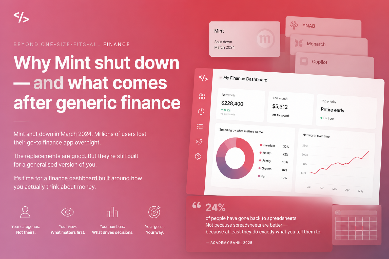
Generic finance apps are built for everyone. That is exactly why they do not work for you.
Our goals for this article:
- Think through what your dashboard actually needs to do before you build a single screen
- Understand the three main finance dashboard types and which fits your situation
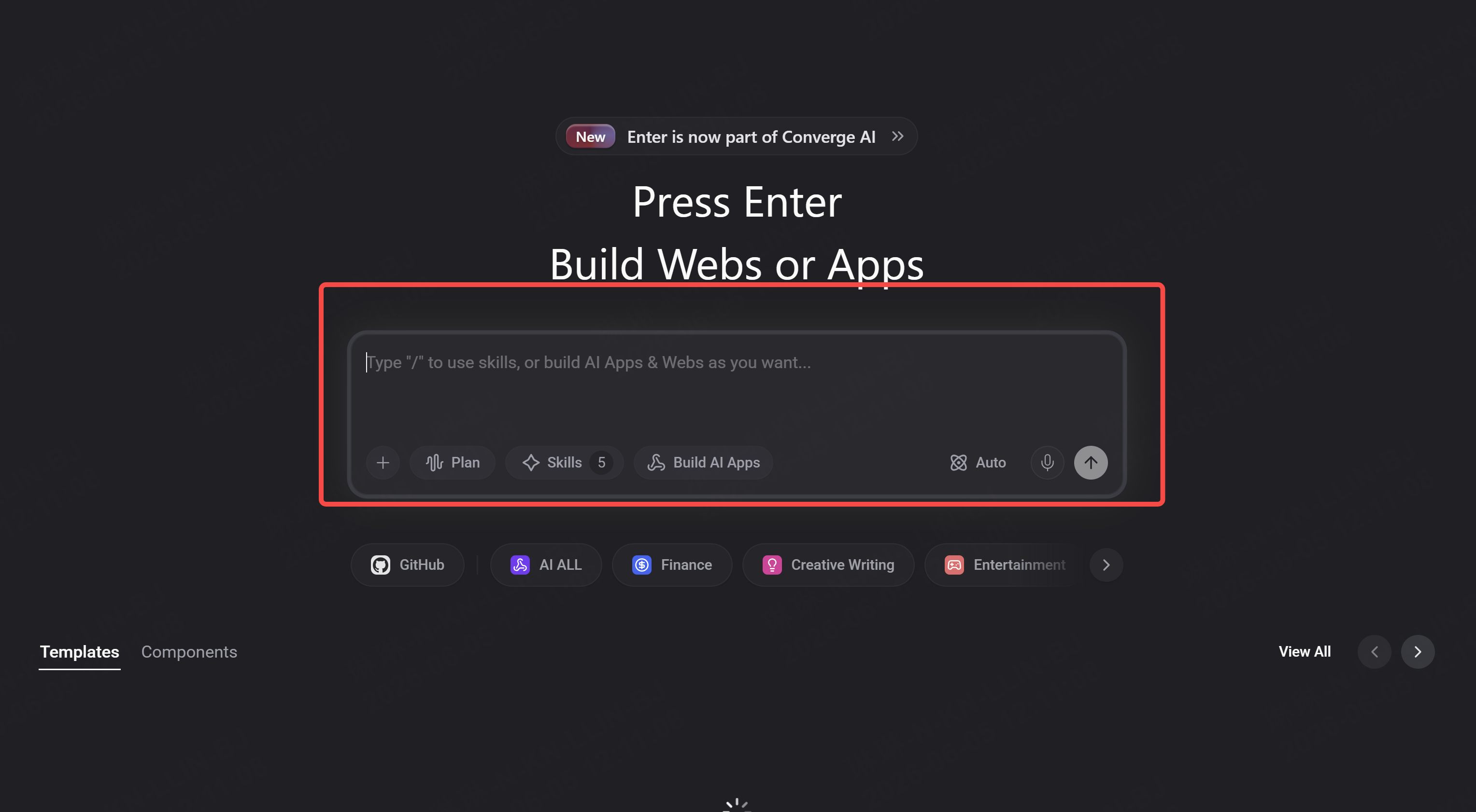
- Build a working version in Enter with Cloud DB and Visual Editor
- See specifically how Enter Pro extends what the dashboard can do
Before You Build: What Does Your Dashboard Actually Need to Do?
Most people open a builder and immediately start describing what it looks like. Colors, layout, card sizes. This is the wrong starting point.
The right starting point is function. What question does this dashboard answer when you open it?
Ask yourself one thing before writing your first prompt:
When I open this dashboard in the morning, what is the one number or view that tells me everything I need to know?
Your answer determines what you build.
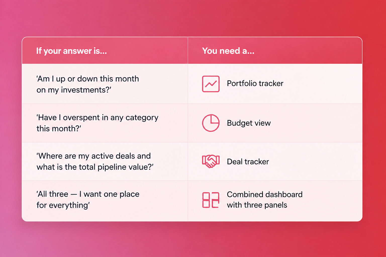
Pick one to start. You can combine later. Trying to build all three at once on your first session usually produces something that does none of them well.
The Three Dashboard Types
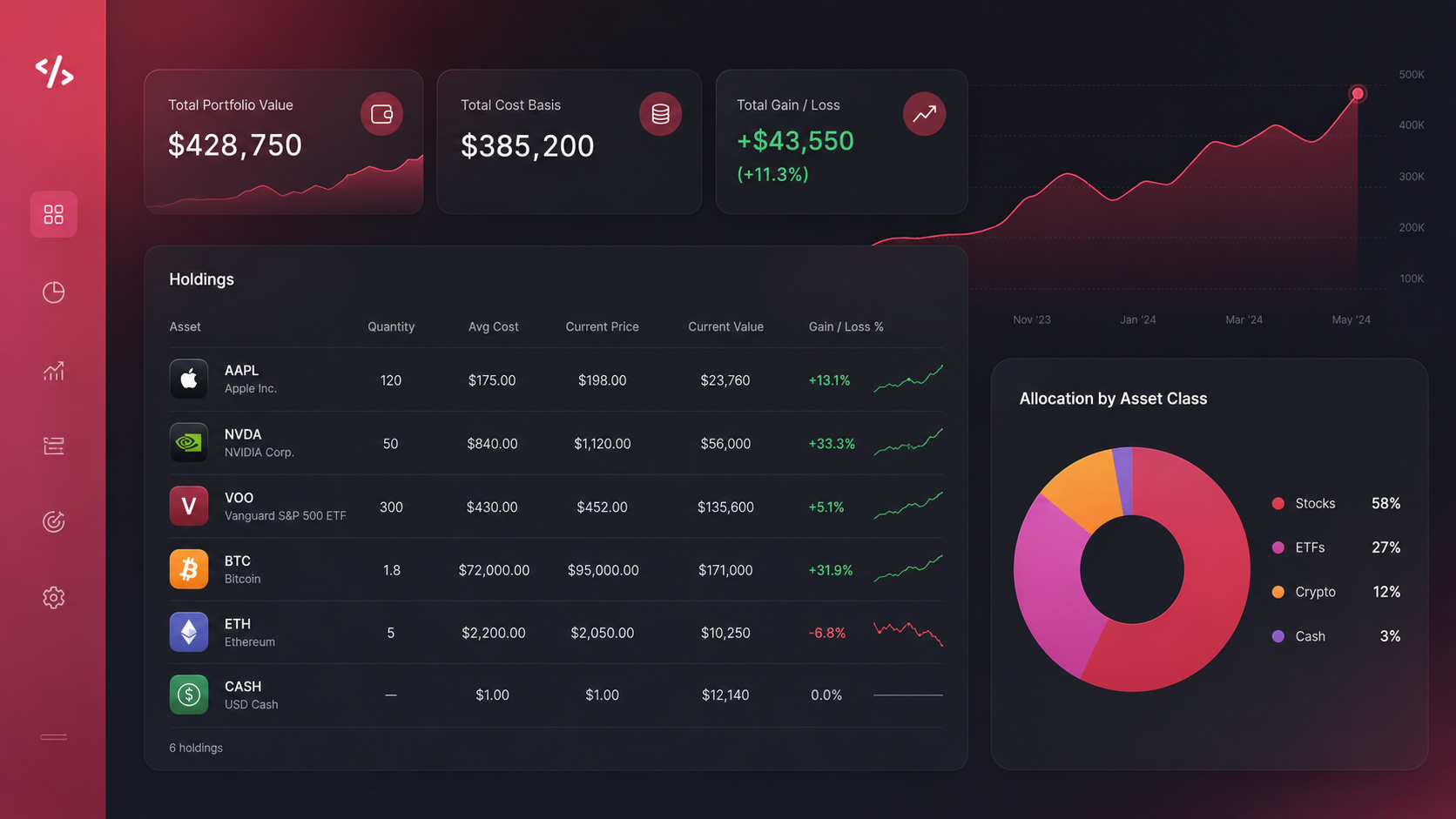
Type 1 — Portfolio Tracker
What it needs to do:
- Show current holdings with value and allocation percentage
- Show overall portfolio performance vs. a starting value or benchmark
- Flag which positions are up, down, or flat
- Track changes over time — not just today's snapshot
Database structure:
| Table | Key columns |
| holdings | id, asset_name, ticker, quantity, average_cost, current_price, asset_class |
| price_history | id, holding_id, date, price |
| portfolio_snapshots | id, date, total_value, total_cost, gain_loss |
Build prompt:
"Build a portfolio tracker dashboard. Dark background, minimal design — clean and data-forward. Show a top summary row with total portfolio value, total cost, overall gain/loss in dollars and percentage. Below that, show each holding as a row in a table: asset name, quantity, average cost, current price, current value, gain/loss percentage. Color-code positive positions green and negative ones red. At the bottom, show a pie chart of allocation by asset class. Pull all data from the holdings table in my database."
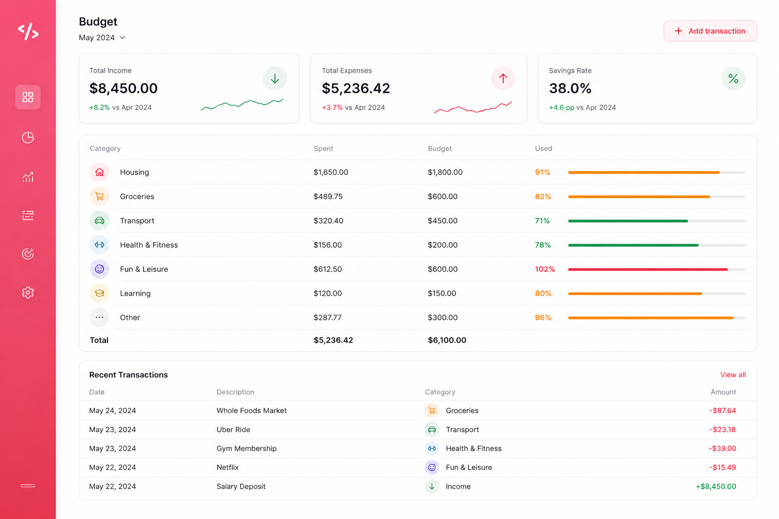
Type 2 — Budget View
What it needs to do:
- Show income vs. expenses for the current month
- Break expenses down by category — your categories, not preset ones
- Show how much of each category budget has been used
- Display savings rate clearly
Database structure:
| Table | Key columns |
| transactions | id, date, description, amount, category, type (income/expense) |
| budgets | id, category, monthly_limit, month, year |
| monthly_summary | id, month, year, total_income, total_expenses, savings_rate |
Build prompt:
"Build a budget dashboard for the current month. White background, clean and readable. At the top: total income, total expenses, and savings rate as three large numbers side by side. Below that: a row for each spending category showing category name, amount spent, budget limit, and a horizontal progress bar — green when under 80%, amber at 80-99%, red at 100%+. Below that: a list of recent transactions with date, description, category, and amount. Let me add new transactions directly in the dashboard. Pull everything from the transactions and budgets tables."
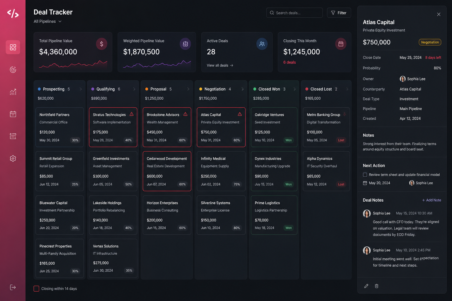
Type 3 — Deal Tracker
For investors, sales professionals, real estate agents, or anyone managing a pipeline of opportunities.
What it needs to do:
- Show all active deals with their current stage
- Display total pipeline value
- Flag deals by urgency or close date
- Track notes and next actions per deal
Database structure:
| Table | Key columns |
| deals | id, deal_name, counterparty, value, stage, close_date, probability, owner |
| deal_notes | id, deal_id, note_text, created_at |
| pipeline_summary | id, date, total_pipeline_value, weighted_pipeline_value |
Build prompt:
"Build a deal tracker dashboard. Dark background, professional feel. Top row: total pipeline value, weighted pipeline value (value × probability), number of active deals, and deals closing this month. Below: a kanban board with columns for each deal stage — Prospecting, Qualifying, Proposal, Negotiation, Closed Won, Closed Lost. Each deal shows as a card with deal name, counterparty, value, and close date. Cards closing within 14 days get a red border. Click a deal card to open a side panel with full details and a notes section. Pull from the deals and deal_notes tables."
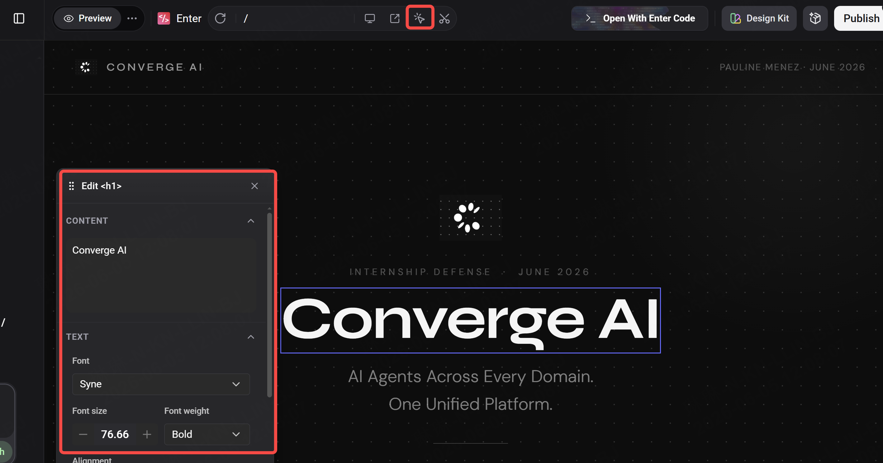
Making It Yours — The Visual Editor
The prompts above build something functional. The Visual Editor makes it personal.
After your first build, open the Visual Editor and adjust without writing another prompt:
- Typography — if numbers are the focus, make them bigger. Hierarchy matters in a dashboard.
- Color coding — your green might be different from the default. Click any element and change the exact shade.
- Spacing — financial data needs room to breathe. Increase padding inside cards if anything feels cramped.
- Layout order — drag sections to match how you actually scan. The number you look at first should be at the top left.
The rule for finance dashboards specifically: what you see first should be the thing that tells you whether today is a good day or a day that needs attention. Everything else is detail.
How to Use Enter Pro
Once your dashboard is built and running, Enter Pro extends what it can do — in three specific ways.
Ask your data questions in plain English
With Enter Pro's AI Agent connected to your Cloud DB, you can query your own financial data without writing anything technical:
"What was my average monthly spend on food in the last six months?""Which of my holdings has the highest unrealised gain as a percentage?""How many deals have closed in the last 90 days and what is the total value?"
The agent reads your database and answers directly. No SQL. No pivot tables. Just a question.
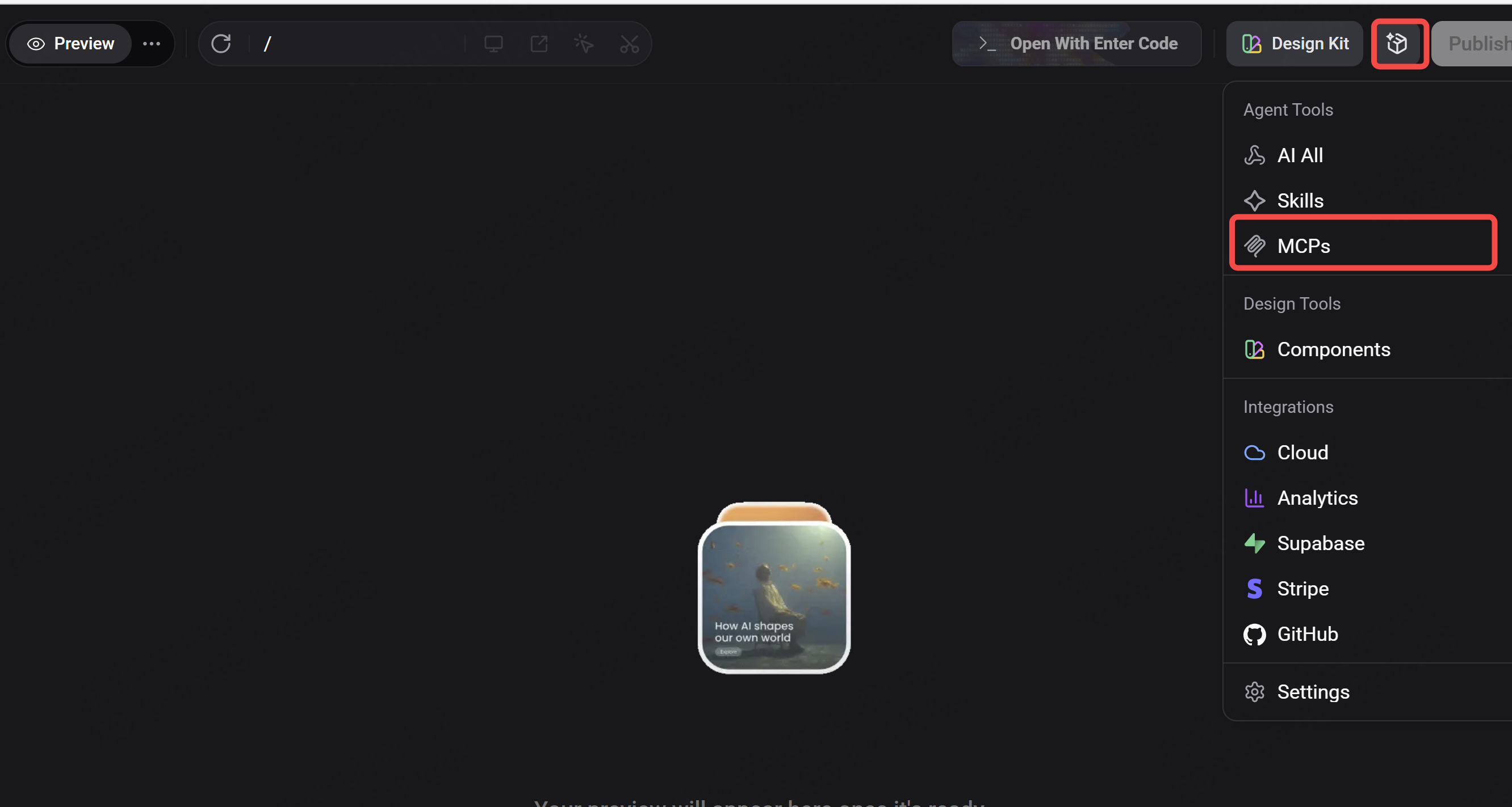
Connect external data sources via MCP
If you want your portfolio tracker to pull live prices automatically — rather than entering them manually — connect Alpha Vantage via MCP (covered in the previous article in this series). Once connected:
"Update the current_price field for every holding in my database using live data from Alpha Vantage."
Your dashboard refreshes with real prices every time you ask.
Generate analysis and reports
"Look at my transactions table for the last three months and write a one-paragraph summary of where I am overspending relative to my budgets. Be specific.""Compare my portfolio performance this quarter vs. last quarter and tell me which positions changed the most."
The AI Agent does not just display your data — it reads it, interprets it, and tells you what it means. That is the difference between a dashboard and a tool that actually helps you make decisions.
The One Thing to Get Right
A finance dashboard fails when it shows you everything. It works when it shows you the right thing first.
Before you hit publish, look at your dashboard as a stranger would. Is the most important number immediately obvious? Does the layout match how you actually think about your finances — or does it match a generic template?
If something is not where your eye naturally goes, move it. The Visual Editor makes that a two-second adjustment.
The best finance tools are not the most feature-rich ones. They are the ones you actually open every day because they give you what you need at a glance.