Zero to Hero: How to Make Your App Not Look Like Every Other AI App
A practical guide to visual identity for builders who aren't designers — how to describe what you want, escape the generic AI aesthetic, and make something that actually looks like you.
You know the look.
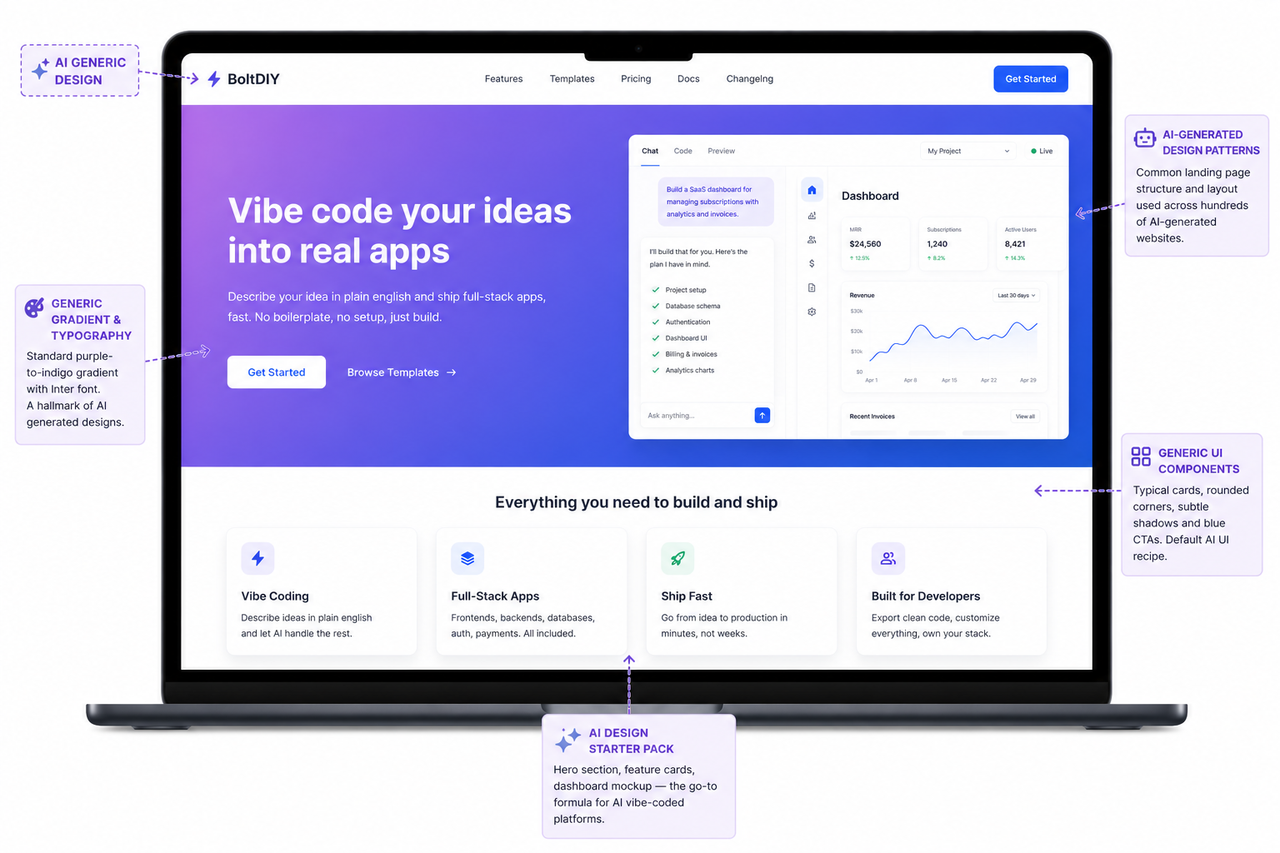
White background. Blue button. Inter font. A hero section with a purple-to-indigo gradient. Cards with identical rounded corners and the same faint drop shadow. A navigation bar with your logo on the left and a "Get Started" button on the right.
You have seen it a hundred times. And the moment you generated your first app, you saw it again — except this time, it was yours.
This is the most searched, least answered question in vibe coding right now: how do you make something that looks like you?
The answer is not a technical fix. It is a description problem. And this article is going to solve it.
Our goals for this article are simple:
- Why AI defaults to the generic look — and what is actually happening when it does
- The vocabulary you need to describe design without a design background
- A step-by-step process to go from generic to distinctive, right here on Enter
1. Why Does AI Default to the Same Look?
AI learns from what exists. When you ask for something "professional" or "clean" or "modern," it reaches for the statistical average of every professional, clean, modern interface it has ever trained on.
That average has a very specific face:
- White background
- Blue buttons
- Inter font
- Rounded corners
- Shadowed cards
It is not bad design. It is safe design — the kind that offends nobody and distinguishes nobody.
The AI is not making aesthetic choices. It is making probability choices.
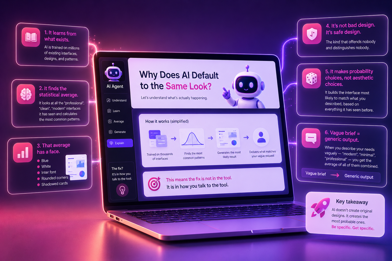
The rule that changes everything: vague brief → generic output. Every time.
The fix is not in the tool. It is in how you talk to the tool.
2. The Mental Shift: You Are the Art Director
Most people think they need technical knowledge to describe design — font names, color codes, CSS properties. Wrong frame.
You are the art director, not the designer.
An art director points to a mood board and says: "I want it to feel like this — but warmer, and with more edge." The designer figures out the execution.
You have been developing this skill your whole life:
- Walking into a café and immediately knowing if it felt right
- Landing on a website and closing it in three seconds because it felt off
- Looking at something and thinking "this is trying too hard" or "this feels expensive"
That is design literacy. It just never had an output channel before. Vibe coding gives it one.
Your taste is not the problem. Your description of your taste is. And that is a learnable skill.
3. From Generic to Distinctive: Step by Step
Build Your Vocabulary First
Design does not require a degree. It requires the right words. Here are the categories that do the most work:
Mood words — what should the product feel like?
| Instead of... | Try... |
| Professional | Editorial, clinical, structured |
| Clean | Understated, minimal, precise |
| Modern | Bold, cinematic, raw |
| Friendly | Warm, playful, approachable |
1- Reference industries — some industries have instantly recognizable aesthetics. Tell the AI your product should feel like one of these:
- Architecture firm
- Fashion magazine
- Financial terminal
- Luxury hotel
- Independent bookstore
- Medical journal
2- Typography direction — you do not need to name specific fonts. You need to choose a direction:
- Serif (small horizontal strokes at letter ends — think newspapers, books) → feels established, literary, trustworthy
- Sans-serif (clean, no strokes — think most tech products) → feels modern and direct
3- Spacing and contrast:
- High contrast or soft?
- Dense or spacious?
- Heavy typography or light?
These choices do more than any color to define how something feels.
Step 1 — Start With What Already Exists on Enter
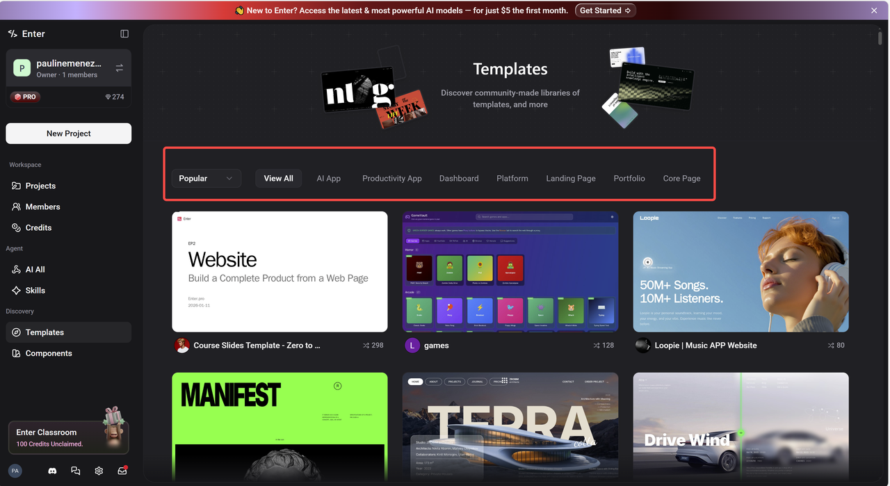
Before writing a single word of your prompt, the fastest way to find your visual direction is already inside Enter.
On the homepage, scroll past the chat input. You will see two tabs: Templates and Components.
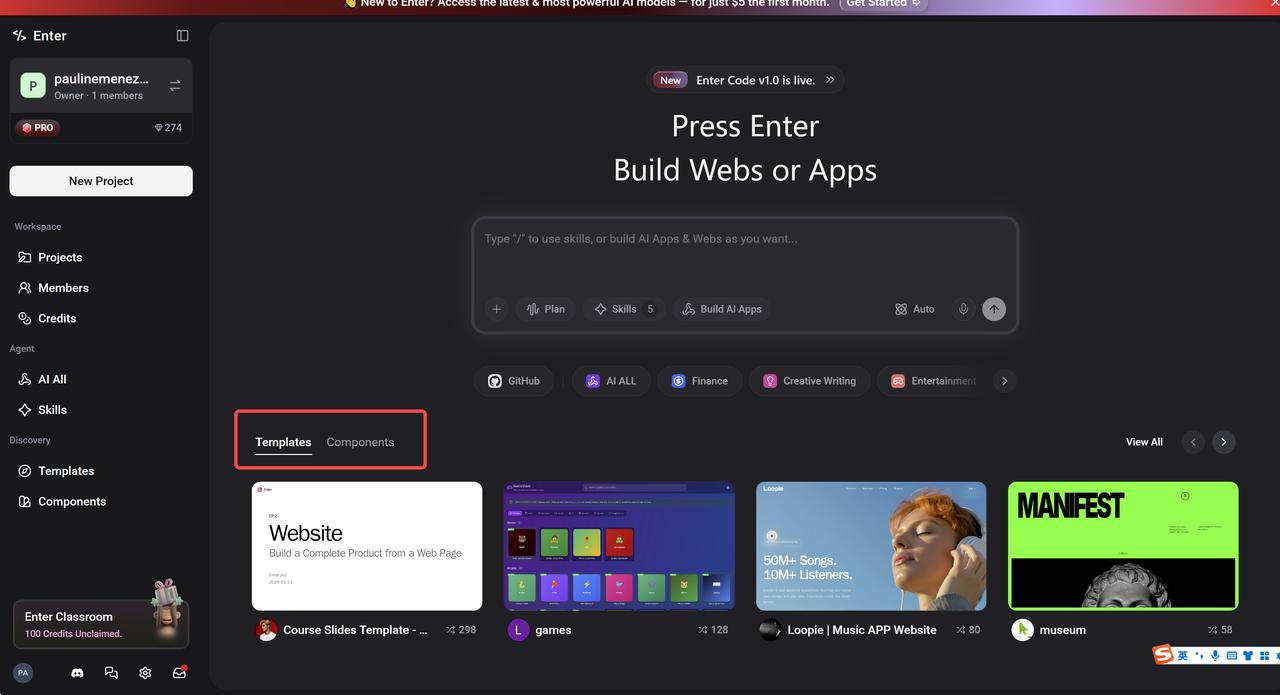
Templates are complete starting points — each one a different aesthetic world:
- A bold editorial layout
- A dark gaming interface
- A clean music platform
- A minimal course presentation
Browse them not to copy, but to react. Your reaction is information.
Components go one level deeper — individual building blocks: cards, navigation bars, hero sections, pricing tables. If you like how a specific component handles typography or spacing, use it as your anchor point.
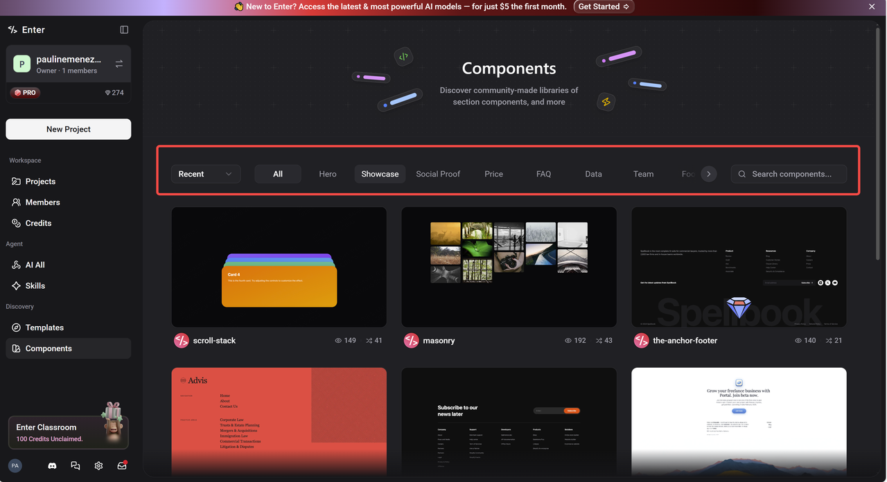
The move: Browse → react → write down what you notice. Not "I like this one." Specifically:
- "I like that headings are large and body text is small"
- "I like that there is only one accent color and everything else is black and white"
- "I like how much space there is between elements — nothing feels crowded"
Those observations are your brief.
Step 2 — Write a Specific Prompt
Take everything you gathered and put it into your prompt.
| ❌ Generic | ✅ Specific |
| "Build a portfolio with a modern, professional design." | "Build a portfolio that feels like an independent architecture studio — minimal, spacious, confident. Black background, warm cream text, one muted terracotta accent. Tall serif heading, clean sans-serif body. Asymmetric layout. One strong line of text upfront, no hero image. Navigation almost invisible." |
Same idea. Completely different results.
→ Need help writing a strong first prompt? See our Vibe Coding Guide for Non-Technical Founders
Step 3 — Make the Three Decisions That Carry 80% of the Weight
Three decisions determine whether something looks distinctive or generic:
Color palette
- One background color One text color One accent color Name them specifically (off-white, near-black, deep forest green) — not "something neutral"
2. Typography
- One direction for headings (serif or sans-serif) One for body text Ask for something editorial, technical, or warm — the AI will choose accordingly
3. Spacing
- Generous beats cramped, almost always If something looks cheap or crowded → ask for more breathing room, more white space, more padding inside cards You will see the difference immediately
Step 4 — Use the Visual Editor for the Last 20%
There is a point where describing a change is slower than just making it directly:
- The margin between sections is two pixels too tight
- The button color is right but slightly too saturated
- The heading size needs to come down just a little
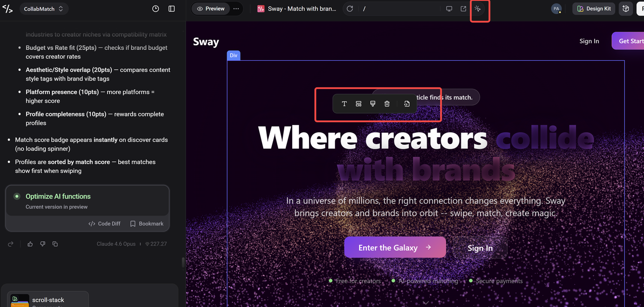
This is where Enter's Visual Editor changes the dynamic. Click the element → adjust directly (font size, color, spacing, layout) → no new prompt, no new generation, no risk of breaking something else.
The workflow:
- Browse templates → find your reaction
- Describe the direction → generate
- Click to refine → Visual Editor
- Publish
AI gets you 80% of the way there fast. The Visual Editor handles the last 20% precisely.
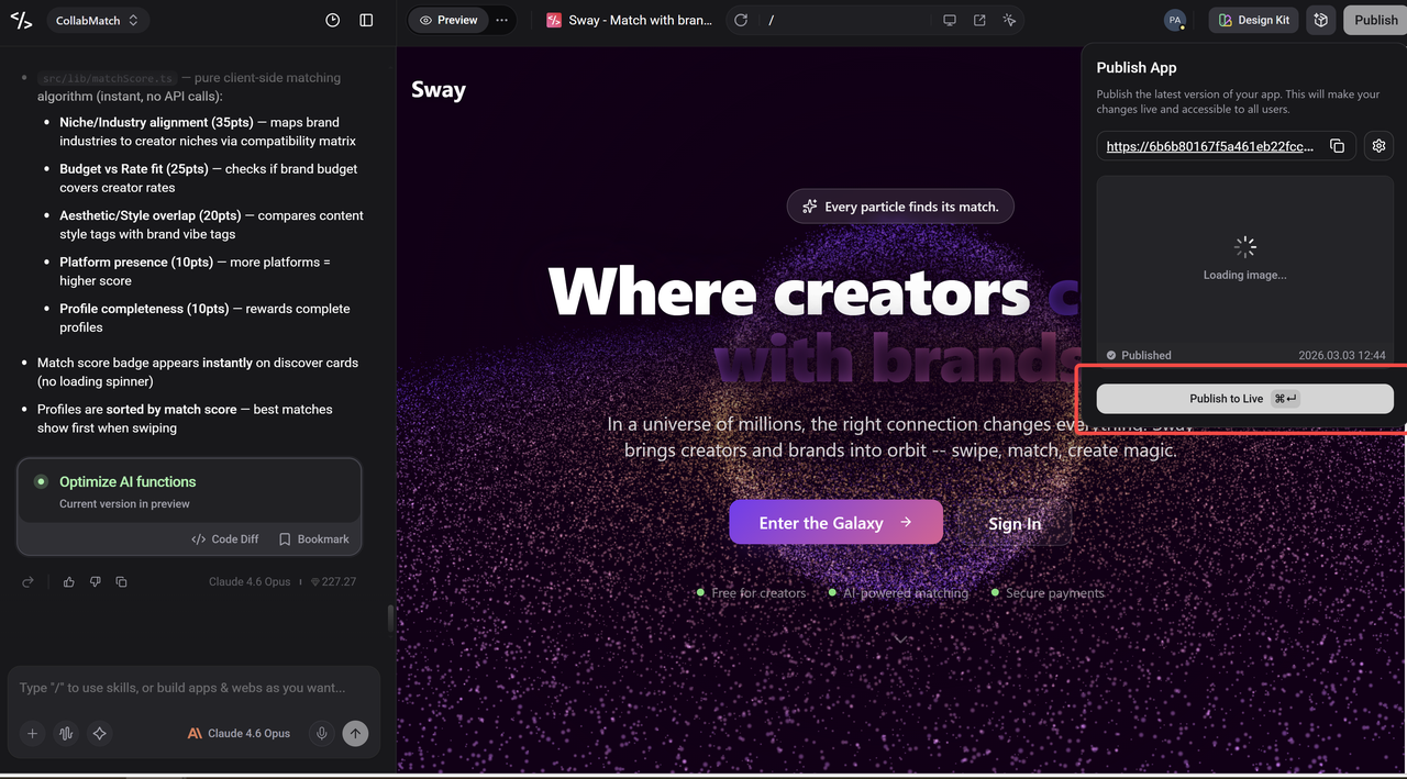
Step 5 — Publish and Look at It Fresh
When it feels close, hit publish.
Enter deploys it instantly to a live URL. Then open that link on your phone, step away from your desk, and look at it as a stranger would.
Ask one question: does this look like it was made by someone with a point of view?
- Yes → you are done
- No → you now know what is missing — describe the gap, refine, repeat
That is the loop. It gets faster every round.
What's Next in the Series
You now know why generic happens and exactly how to avoid it. Your next build should look like yours.
Next time, we are going one level deeper. Because design is one thing — but building something people actually want to use is another. We are going to talk about the most common mistake founders make after they get the look right: building the wrong thing beautifully. How to find the right problem, how to validate before you build, and how to make sure what you ship is worth shipping.
See you soon.