
Best Practices for UI Design: 15 Tips for Better Interfaces
Discover the best practices for UI design to create intuitive, accessible, and responsive digital experiences. Learn proven principles for websites, mobile apps, and online stores that improve usability and user satisfaction.
A great user interface helps people accomplish tasks quickly, confidently, and without confusion. Whether you're designing a website, mobile app, SaaS platform, or online store, following proven UI principles leads to higher engagement and better user satisfaction.
This guide explores 15 best practices for UI design that can help you create intuitive, accessible, and responsive digital experiences. Best of all, with modern workspaces like Enter Pro, you can instantly turn these professional design principles into clean, responsive layouts through intuitive, text-based workflows, accelerating your production timeline.
Core principles of effective UI design
Effective UI design rests on foundational principles that ensure interfaces are intuitive and delightful.
- Visual hierarchy: Guide users' attention using size, color, contrast, spacing, and alignment. Make primary actions (e.g., CTAs) stand out while de-emphasizing secondary elements.
- Consistency: Maintain uniform buttons, typography, colors, icons, and interactions across the product. This reduces cognitive load and builds user confidence.
- Clarity and simplicity: Eliminate clutter. Every element should serve a purpose. Follow "less is more" to create clean layouts that load quickly and feel effortless.
- Progressive Disclosure: Reveal information step-by-step to avoid overwhelming users, especially in complex flows like forms or onboarding.
- Accessibility: Ensure sufficient contrast, keyboard navigation, alt text, and WCAG compliance, so your design works for everyone.
15 best practices for UI design
Following the best practices for professional UI design helps create intuitive, consistent, and user-friendly interfaces. Here are 15 essential UI design best practices to improve usability and deliver better digital experiences.
Keep the interface simple
A simple interface allows users to focus on completing tasks instead of figuring out how the product works. Remove unnecessary elements, limit distractions, and prioritize essential features. Use clean layouts, concise text, and clear navigation to reduce cognitive load. Every component should have a purpose. Simplicity makes products easier to learn, speeds up interactions, and creates a more enjoyable experience for both new and returning users.
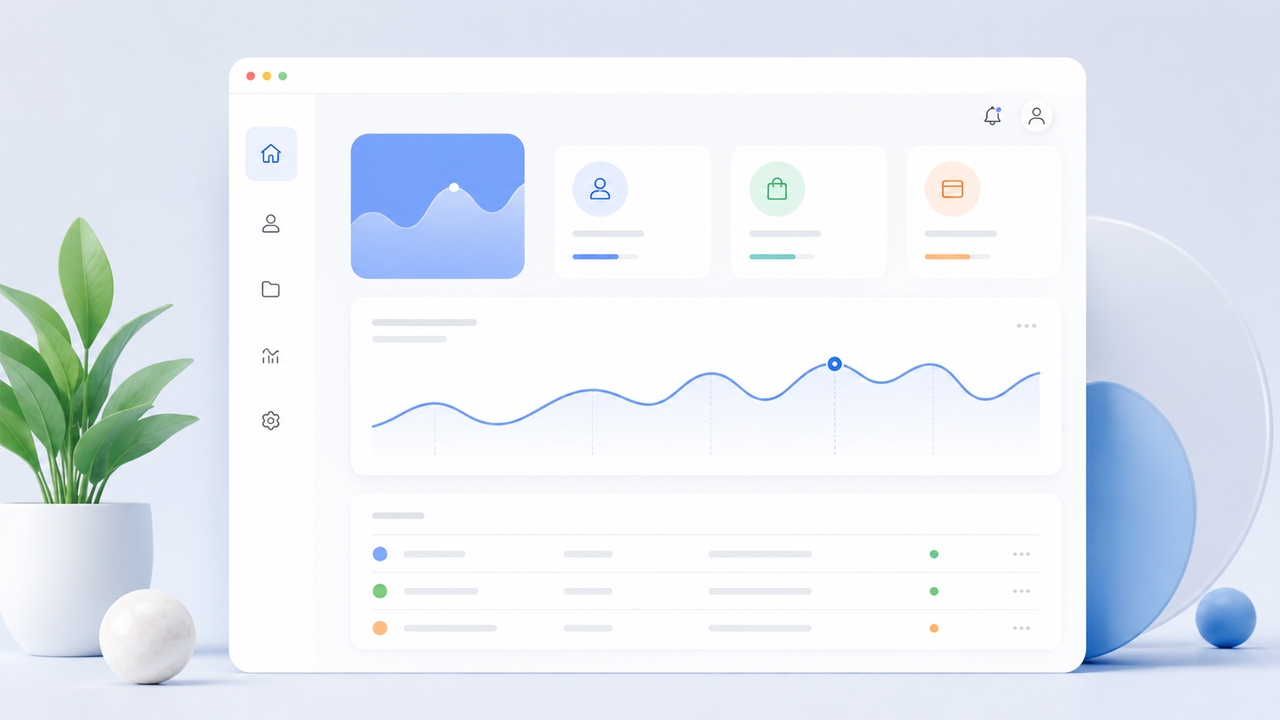
Maintain consistency across the interface
Consistency helps users build familiarity with your product. Use the same colors, typography, button styles, icons, spacing, and interaction patterns throughout every screen. Consistent design reduces confusion because users know what to expect when interacting with different parts of the interface. Establishing a design system or component library also helps teams maintain visual and functional consistency as the product grows.
Create a strong visual hierarchy
Visual hierarchy guides users toward the most important information first. Use font size, weight, spacing, color, and contrast to organize content and emphasize key actions. Headlines should stand out, primary buttons should be easy to identify, and supporting information should remain secondary. A well-structured hierarchy helps users scan pages quickly, understand content more easily, and complete tasks with less effort.
Design with accessibility in mind
Accessible UI design ensures everyone can use your product, including people with disabilities. Provide sufficient color contrast, readable fonts, keyboard navigation, descriptive labels, and compatibility with assistive technologies. Avoid relying only on color to communicate information. Accessibility improves usability for all users while helping products meet modern design standards and reach a broader audience with inclusive digital experiences.
Prioritize responsive design
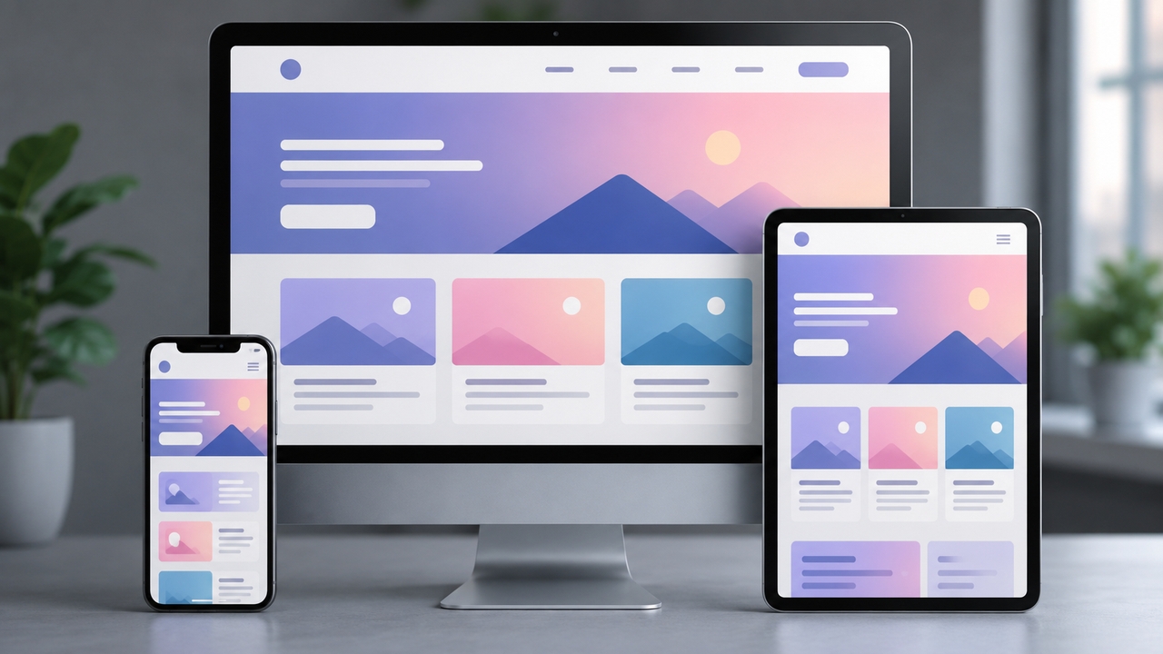
Users access digital products on desktops, tablets, and smartphones, making responsive design essential. Build flexible layouts that adapt to different screen sizes without sacrificing usability. Ensure buttons remain easy to tap, text stays readable, and navigation works seamlessly across devices. A responsive interface delivers a consistent user experience, regardless of the device or screen size being used.
Provide immediate feedback for user actions
Every interaction should generate a clear response so users know their action has been recognized. Display loading indicators, confirmation messages, hover states, progress bars, or subtle animations after clicks and form submissions. Timely feedback reduces uncertainty and builds confidence in the interface. Even small visual cues help users understand what is happening and make the experience feel more responsive.
Make navigation intuitive
Navigation should help users find information without unnecessary effort. Organize menus logically, use familiar navigation patterns, and keep labels descriptive. Include search functionality when appropriate and make important destinations easy to access. Users should always understand where they are within the interface and know how to move between sections. Clear navigation improves efficiency and reduces frustration during every interaction.
Reduce cognitive load
People should not have to remember excessive information while using your product. Present information in manageable sections, group related content, and remove unnecessary choices whenever possible. Break complex workflows into smaller steps and provide helpful guidance throughout the process. Reducing cognitive load allows users to make decisions faster and complete tasks with greater confidence and fewer mistakes.
Design user-friendly forms
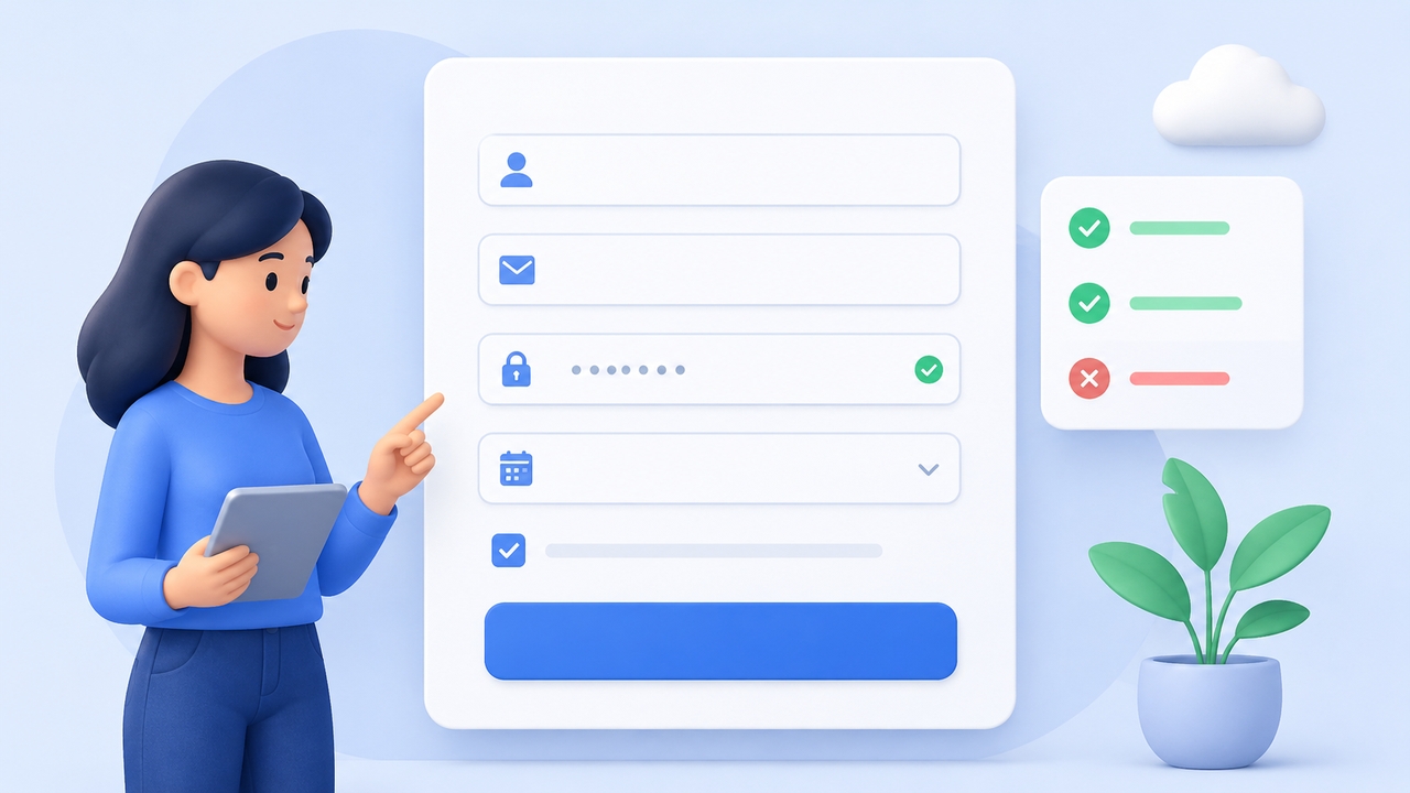
Forms are often where users sign up, make purchases, or submit important information. Keep forms short, request only essential details, and provide clear labels instead of relying solely on placeholders. Validate entries in real time and display helpful error messages when needed. Well-designed forms improve completion rates, reduce abandonment, and create a smoother overall user experience.
Use whitespace effectively
Whitespace gives content room to breathe and makes interfaces easier to scan. Proper spacing separates sections, improves readability, and draws attention to important elements without adding visual clutter. Resist the temptation to fill every empty area with content. Thoughtful use of whitespace creates a cleaner design, enhances focus, and gives users a more comfortable browsing experience across all devices.
Design clear and effective calls to action
Calls to action should clearly communicate the next step users should take. Use action-oriented text such as "Start Free Trial" or "Download Now" instead of vague labels. Make primary buttons visually distinct through size, color, and placement while maintaining consistency throughout the interface. Strong calls to action guide users naturally toward completing desired tasks and improving conversion rates.
Optimize interface performance
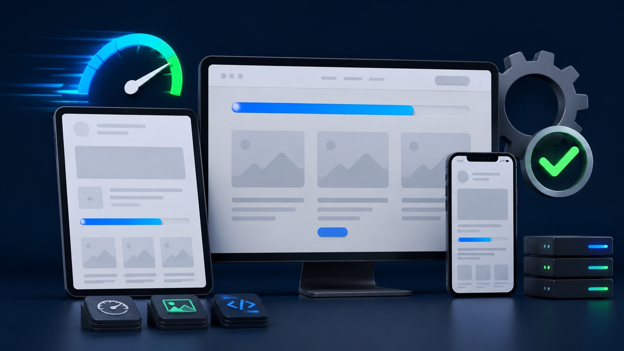
Performance is a critical part of the user experience. Fast loading pages, responsive interactions, and optimized assets make interfaces feel smoother and more reliable. Compress images, minimize unnecessary scripts, and load content efficiently. Skeleton screens and progress indicators can also improve perceived speed during loading. Users are more likely to stay engaged when the interface responds quickly and consistently.
Test with real users regularly
User testing reveals usability issues that designers may overlook. Observe how real people interact with the interface, identify areas of confusion, and gather feedback on workflows and navigation. Combine usability testing with analytics, heatmaps, and A/B testing to validate design decisions. Continuous testing helps teams improve the interface based on actual behavior instead of assumptions, resulting in better experiences over time.
Follow established design patterns
Users are already familiar with common interface patterns such as shopping carts, search icons, breadcrumbs, and standard navigation menus. Leveraging these conventions reduces the learning curve and allows users to interact with confidence. While innovation is valuable, changing well-understood patterns without clear benefits often creates unnecessary confusion. Familiar interactions improve usability and speed up task completion.
Continuously improve using data and feedback
Great UI design evolves over time rather than remaining static. Monitor user behavior, analyze analytics, review customer feedback, and identify areas where users struggle. Regularly refine layouts, interactions, and workflows based on measurable insights. Small improvements made consistently can significantly enhance usability, increase engagement, and support long-term product growth while keeping the interface aligned with changing user expectations.
Best practices for mobile app UI design
Designing for mobile devices requires a user-first approach that prioritizes speed, simplicity, and touch-friendly interactions. Following the best practices for app UI design helps create apps that are intuitive, responsive, and easy to use across different devices.

Design for thumb-friendly navigation
Place frequently used actions within easy thumb reach, especially near the bottom of the screen. Comfortable navigation reduces user effort, improves accessibility, and makes everyday interactions faster and more intuitive.
Use large, touch-friendly controls
Ensure buttons and icons are large enough to tap accurately with sufficient spacing between them. Touch-friendly controls minimize accidental taps, improve accessibility, and create a smoother user experience.
Keep navigation simple
Organize features logically and use familiar navigation patterns with clear labels. Simple navigation helps users find information quickly, reduces confusion, and makes the app easier to learn.
Minimize user input
Reduce typing by using autofill, dropdown menus, date pickers, and other input shortcuts. Request only essential information to speed up tasks and improve the overall user experience.
Optimize for different screen sizes
Create flexible layouts that adapt smoothly to various smartphones and tablets. Test your interface across multiple devices to ensure content remains readable, functional, and visually consistent.
Prioritize performance
Optimize images, animations, and resources to deliver fast loading times and smooth interactions. A high-performing app keeps users engaged, reduces frustration, and encourages long-term retention.
Best practices for online store UI design

An effective ecommerce interface makes it easy for customers to discover products, compare options, and complete purchases. Following these practices helps reduce friction, build trust, and improve conversion rates.
Create clear product navigation
Organize products into logical categories and provide intuitive menus with filters and search. Clear navigation helps shoppers quickly find what they need and improves the overall browsing experience.
Use high-quality product images
Display sharp, detailed images from multiple angles and include zoom functionality where possible. High-quality visuals help customers evaluate products confidently and make informed purchasing decisions.
Highlight clear calls to action
Make buttons like "Add to Cart" and "Buy Now" prominent and easy to identify. Strong calls to action guide shoppers toward completing purchases without confusion.
Simplify the checkout process
Reduce the number of checkout steps, offer guest checkout, and request only essential information. A streamlined checkout minimizes cart abandonment and improves conversion rates.
Build trust with social proof
Display customer reviews, ratings, testimonials, and trust badges throughout the shopping journey. These elements increase credibility and help shoppers feel more confident about their purchases.
Ensure fast and responsive performance
Optimize pages for quick loading and smooth performance across all devices. A fast online store keeps customers engaged, improves user satisfaction, and reduces the likelihood of abandoned sessions.
How Enter Pro supports modern UI design workflows
Enter Pro turns natural language prompts into production-ready React + Tailwind components. Its Design Agent converts ideas and visual references into polished, responsive UI, while the Visual Editor lets teams refine fonts, colors, layouts, and elements in real time.
Design and development run in parallel, removing traditional Figma-to-code handoffs. Multiple AI agents handle UI, backend, bug fixes, and documentation simultaneously. Enter Code then takes over for implementation, writing and refining code in existing repositories, while Enter CLI automates builds and deployments end to end.
Key features of Enter Pro
- Native AI at the core: Enter Pro provides unified access to leading LLMs like GPT, Claude, GLM-5.2, MiniMax-M3, Gemini, and Grok through unified workflows. Build custom AI agents for design, code, and planning to automate workflows and accelerate development.
- Multi-session parallel workflows: Run multiple AI agent sessions simultaneously within one project. Advance design, debugging, and other tasks in parallel to deliver complex projects much faster without waiting.
- Visual editor with real-time preview: Edit elements directly on the live canvas by tweaking fonts, colors, layouts, and styles using a visual editor. AI assists with tedious changes, so you can focus on creative decisions and see instant results.
- Backend and API automation: Automatically handles server logic, databases, storage, and third-party integrations like Supabase and Stripe. Focus on your ideas while the platform manages infrastructure and connections seamlessly in the background.
- Team workspace for collaboration: Create shared workspaces, manage member roles, and collaborate in real time. Use AI-assisted reviews and comments to streamline teamwork across designers, developers, and product managers.
Steps to build UI-driven products with Enter Pro
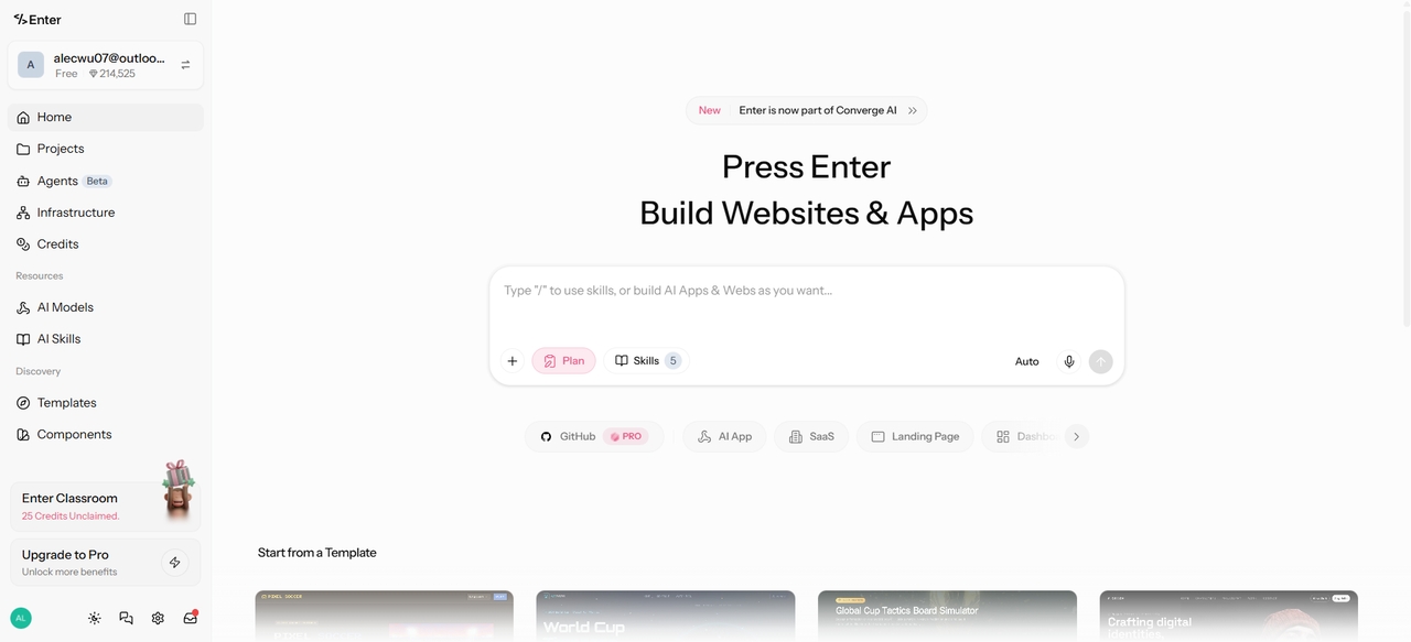
Step 1: Describe your vision
Log in to your workspace and select either a blank project or a pre-made community template. In the prompt field, explain what you want in a natural language. Detail screens, user flows, and design preferences. The AI generates initial layouts, components, and visuals.
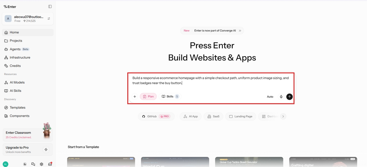
Step 2: Refine with visual editor
Preview the live interface and make direct edits to fonts, colors, layouts, and elements on the canvas. Use AI assistance for rapid iterations while maintaining full control over creative direction.
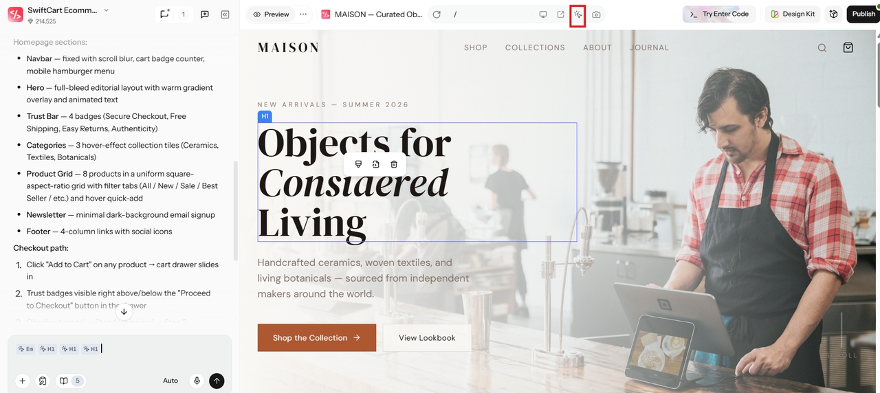
Step 3: Test and publish
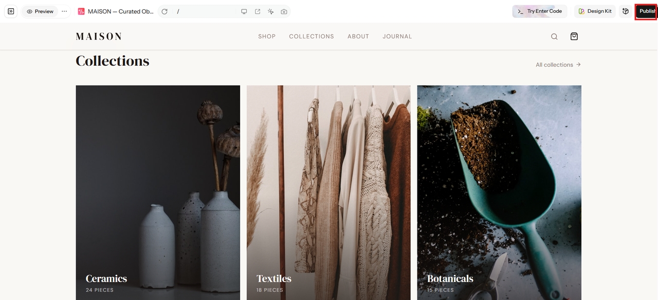
Preview your UI directly within the platform to verify layouts, responsiveness, and user interactions before launch. Once everything is ready, click "Publish' to deploy your production-ready application to the web in just a few clicks.
Conclusion
Mastering these best practices for UI design enables you to create interfaces that are intuitive, accessible, and highly engaging across websites, mobile apps, and online stores. By focusing on simplicity, consistency, responsiveness, and user feedback, you can significantly improve usability and drive better business results.
With Enter Pro, implementing these principles has never been easier. Describe your ideas in natural language, generate production-ready components instantly, refine them visually in real time, and deploy live apps with one click. Whether you're building professional UI designs or responsive interfaces, Enter Pro accelerates your workflow from concept to launch.
FAQs
What are the most important best practices for UI design?
Focus on simplicity, consistency, clear visual hierarchy, accessibility, and responsive layouts. These principles reduce cognitive load, improve usability, and create intuitive interfaces that users love across devices and platforms.
How often should UI designs be updated?
Review your interface regularly using analytics, usability testing, and customer feedback. Continuous improvements help address changing user needs, fix usability issues, and keep your product aligned with evolving design standards.
Why is consistency considered the most critical UI practice?
Consistency creates predictability, helping users build accurate mental models of your application. When buttons and patterns look uniform across all screens, cognitive load drops significantly, which directly boosts conversion and satisfaction.
What are common UI design mistakes to avoid?
Avoid cluttered layouts, inconsistent styling, poor navigation, weak visual hierarchy, tiny touch targets, inaccessible color choices, slow performance, and complicated forms. These issues negatively affect usability and reduce user satisfaction.
What tools do professional UI designers use?
Professional UI designers commonly use Figma, Adobe XD, Sketch, and Framer for design. For development and rapid prototyping, modern teams increasingly rely on Enter Pro to generate production-ready code and iterate visually in real time.