
Master Responsive Web Design: A Complete Guide for Modern Websites
Discover responsive web design essentials: create websites that adapt seamlessly to any device. Learn key principles, benefits, and how Enter's AI-powered builder makes responsive website design simple and fast.
Responsive web design is now essential for any modern website. Many businesses struggle with pages that break on phones or load poorly on tablets. A strong responsive web design approach solves these problems by adapting layouts automatically. In this guide, you will learn what responsive design is and why it matters in 2026. You will also explore its key principles. Plus, how Enter Pro makes it easier to create responsive websites without any coding.
What is responsive web design
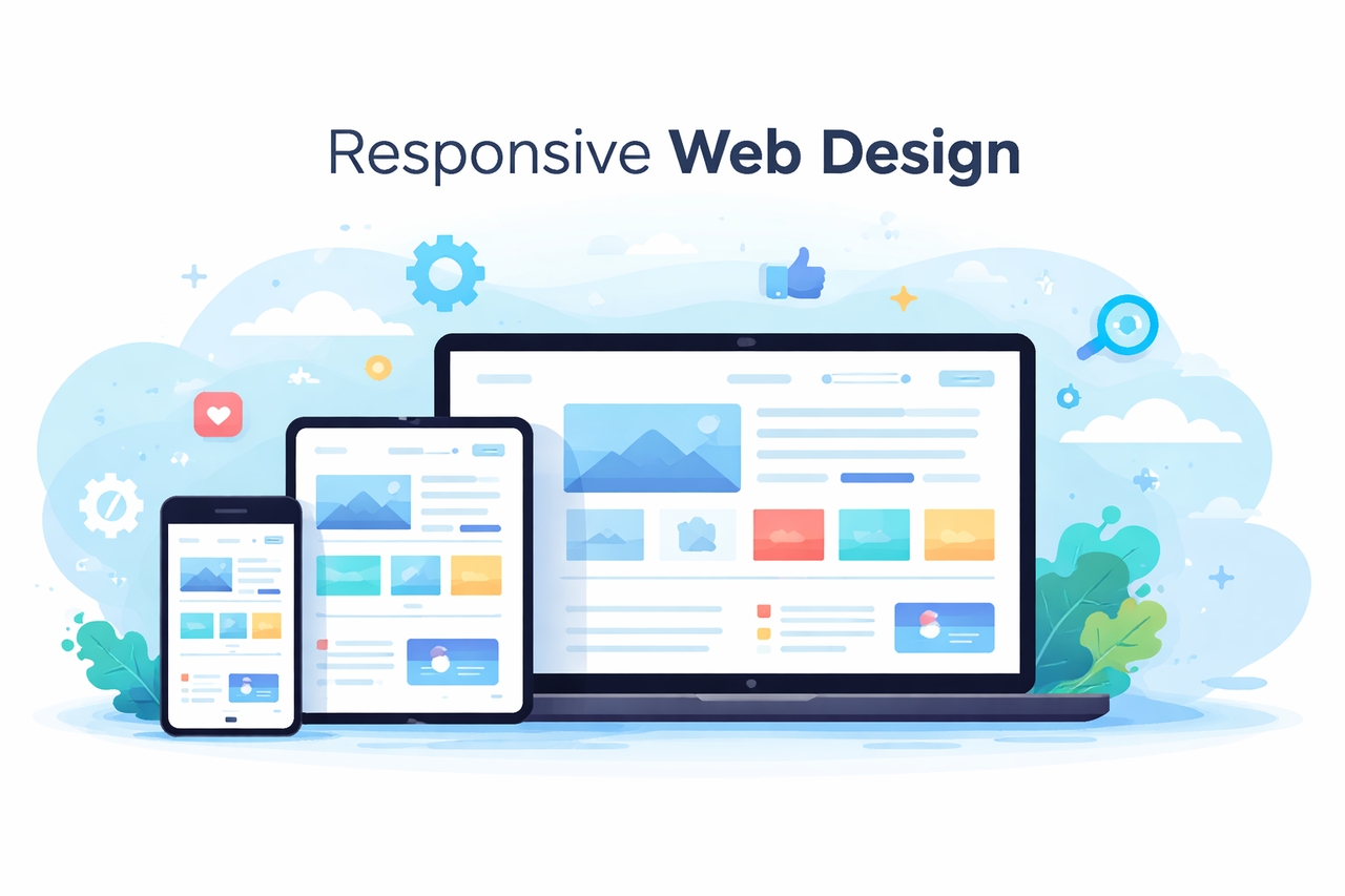
Responsive web design ensures your site adapts to any platform, screen size, or orientation. It delivers consistent quality and a visually appealing experience on every device. By using a single codebase, designers make maintenance faster and development easier. This approach accommodates all users, making sites faster and more accessible. Improved navigation helps people find information quickly. This keeps visitors engaged and can directly boost your sales. Whether on a phone or a desktop, your site remains functional and professional. It is the best way to build for the modern web.
The core pillars of a responsive website
Building a site that flexes requires three main ingredients. These pillars ensure your content looks intentional, not accidental.
- Fluid grids: Forget fixed pixel widths. Fluid grids use percentages, so columns shrink or grow based on the screen width. This allows the layout to flow like water into any container.
- Flexible images: Large photos can break a mobile layout. By setting images to scale within their containers, they never overflow. This keeps visuals crisp without slowing down the page.
- Media queries: These are CSS rules that act like "if-then" statements. They tell the site to change the layout once a screen gets narrower than a specific point. It's how you switch from three columns on a desktop to one on a phone.
Why responsive website design is important in 2026
Modern responsive website design is vital because most people now browse on the go. Your site must work perfectly on every single screen size.
- Mobile traffic dominance: Today, most web traffic comes from smartphones and tablets. If a site only works on a desktop, it misses more than half of its potential audience. A responsive layout ensures that every mobile visitor sees a professional version of the brand, no matter what device they use.
- Improved user experience: Users stay longer when a site is easy to navigate. Responsive design eliminates the need for annoying zooming or side-scrolling. It places buttons and menus exactly where they are easiest to reach, making the entire browsing process feel smooth, natural, and helpful.
- Better SEO rankings: Search engines like Google put websites that work well on mobile devices at the top of their results. Search bots can crawl your content more easily if you have one responsive URL instead of separate mobile and desktop sites. This consistency helps you get more attention and stay at the top of the rankings.
- Faster loading performance: Responsive sites are built to be lean and efficient. By using flexible layouts and optimized images, these pages load much faster on mobile networks. High speed reduces the chance of users leaving early, which is essential for keeping your bounce rates low and engagement up.
- Higher conversion rates: A seamless experience leads to more sales and sign-ups. When a checkout form or contact button works perfectly on a phone, users are much more likely to finish their action. Removing technical friction through responsive design is the fastest way to turn visitors into customers.
Core methods to master responsive web design
You need more than one tool to make a site that works well. It needs a mix of good structure and style. These methods make sure that your site works well in any setting.
- Foundation with HTML and CSS
These core technologies work together to resize, hide, or enlarge elements. HTML provides the essential structure of your page. CSS allows you to control the small details of the design and layout.
- Precision with media queries
To handle different screen sizes, developers use media queries. This CSS technique allows a responsive web page to change its look dynamically. It detects the device type and applies the right styles automatically.
- Fluid vs. Flexbox layouts
You can choose a fluid layout based on percentages to fit the screen. Or, you can use a flexbox layout for more control. Flexbox is great for responsive website design because it fills empty space and prevents messy overflowing.
- Dynamic media and speed
A truly responsive website uses dynamic variables for image height and width. This ensures your visuals never break the layout. Optimizing for speed with compression is also vital. Faster pages keep your bounce rates low.
Build responsive websites effortlessly with Enter Pro
Enter Pro is a development platform, fueled by AI, that centers on Vibe coding. You can create software by describing what you want in natural language. Instead of writing complex code, you simply explain your idea. Enter Pro then creates the design, structure, and backend logic for the website. Enter Pro features multi-model AI integration, full-stack code generation, and live preview. It also has collaborative workspaces where teams can work and build together. Developers, startups, agencies, and creators can quickly launch responsive websites, web apps, and automation tools. The platform reduces technical barriers while keeping full control over the code. Whether you are launching a product site or a business platform, Enter Pro simplifies the process. Next, let's find out how you can create a responsive website using Enter Pro.
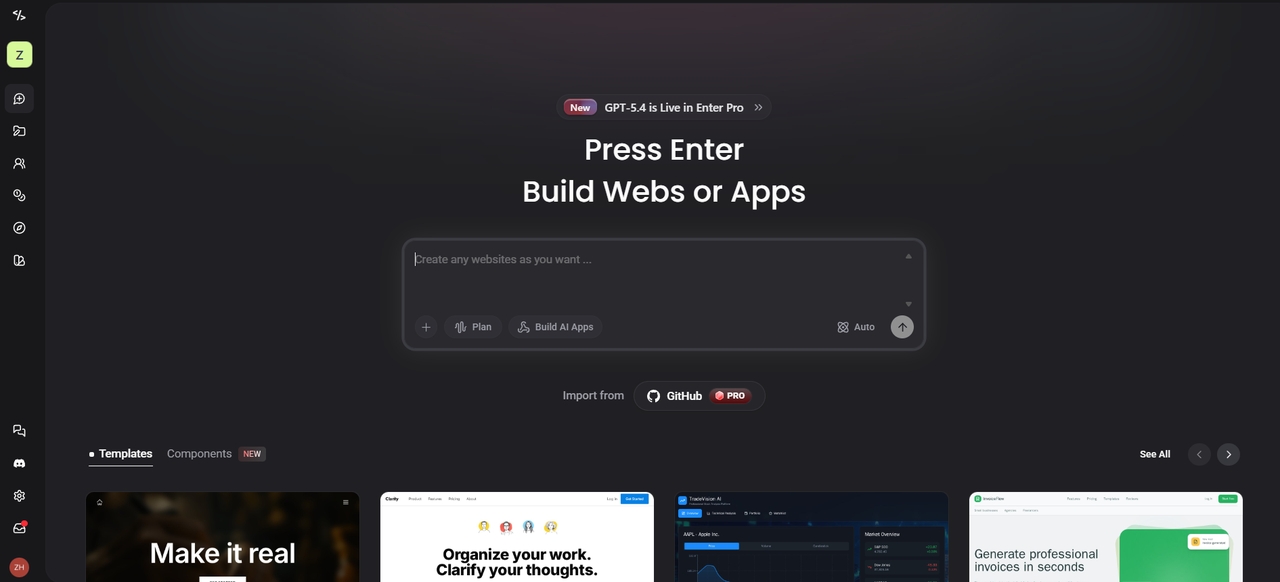
Steps to make a responsive website using Enter Pro
Building a responsive site doesn't have to be a manual chore. With Enter Pro, you can move from a blank page to a fully functional site in simple steps.
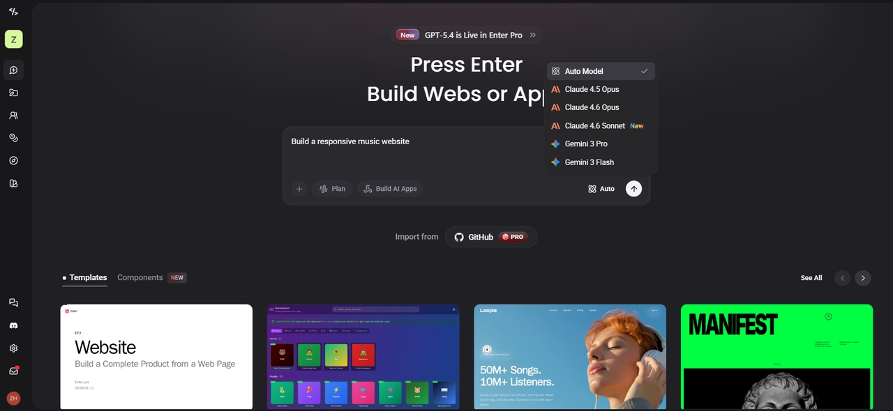
Step 1: Describe your website idea
Begin by outlining your website concept. Provide a brief description of the desired layout, pages, and features. Choose the AI model, and hit the Build button. Enter Pro's AI generates a responsive structure that works across mobile, tablet, and desktop screens.
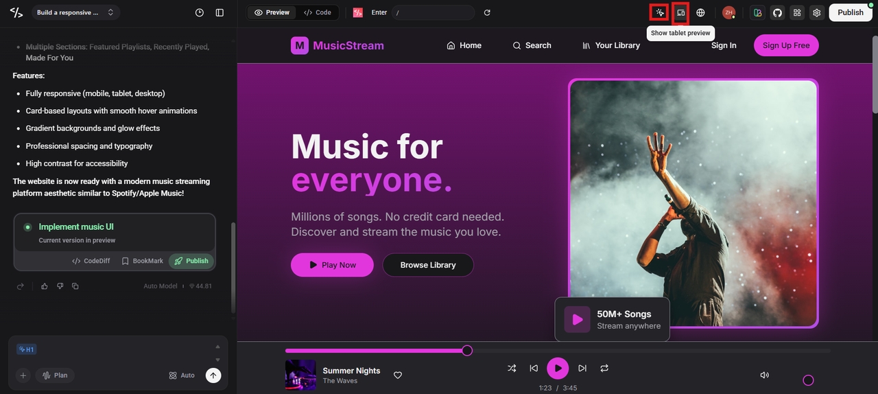
Step 2: Fine-tune with the visual editor
Use our Visual Editor to click any element on the canvas to tweak styles and code instantly. You can update elements through prompts or manual edits. The real-time preview helps you see how the responsive web page looks on different devices.
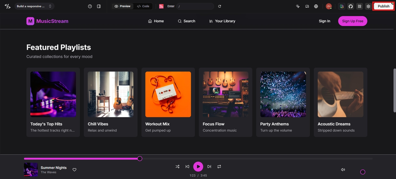
Step 3: Publish the site
When satisfied with the appearance and functionality, click the Publish button. Enter Pro will then prepare the code and publish the responsive site, making it accessible to users on any device.
Notable features of Enter Pro for responsive web design
- Conversational building
You can build websites, web apps, and automation workflows just by chatting. There is no need to write traditional code to get a professional result.
- Multi-model integration
The platform acts as a single gateway to leading AI models. You can toggle between GPT-5.4, Claude 4.6 (Opus & Sonnet), Gemini 3 Pro, and Grok to find the best logic for your site.
- Full-stack generation
The platform generates both frontend and backend code at the same time. It can create UI components, APIs, database schemas, and custom AI agents. This speeds up development and reduces manual setup.
- Real-time previews
Enter Pro provides live previews while you build. Developers can instantly see how a responsive web page looks and behaves. The natural-language API also allows you to query or update data directly.
- Team workspace & real-time collaboration
Invite team members with role-based access (Owner, Manager, Editor, Viewer). Collaborate with team members on shared projects with AI-assisted reviews, comments, task execution, and editing. Suitable for use in agencies, startups, and collaborative builds.
Best practices for responsive websites
Building a truly excellent website demands a user-centric approach at every stage. These practices will help you create a responsive web design that's both professional and user-friendly.
- Adopt a mobile-first approach
Start with designing for the smallest screens. This is essential because it will allow you to keep only the essential content and features. After designing for mobile screens, you can then scale up your layout to larger screens.
- Implement fluid grids
Move away from fixed pixel widths. Instead, use percentage-based widths. This will allow you to have a fluid layout that can flow into larger screens. Using fluid grids will prevent horizontal scrolling and keep your layout perfectly aligned.
- Optimize for touch navigation
Make sure that buttons and links are big enough to tap on mobile devices. Remember the "thumb zone" so that users can easily move around with one hand without having to stretch to reach the top corners.
- Prioritize performance and speed
Your responsive website should be fast. Make sure images on your website are compressed to make it faster. A fast website makes visitors happy and increases your search engine rankings.
- Test across multiple devices
Make sure to test how your responsive web page looks on different devices. Try out layouts on phones, tablets, and computers. This makes sure that the design works right everywhere and that the content is still easy to read.
Conclusion
Responsive web design ensures websites work smoothly on any screen. This guide examined the fundamental concepts, advantages, and actionable techniques for creating flexible layouts. A thoughtfully constructed responsive website enhances user experience, boosts SEO rankings, and increases conversions. Enter Pro makes the process much easier with AI-powered Vibe Coding, full-stack generation, and real-time previews. Whether you are a developer, startup, or creator, Enter Pro helps you build responsive websites faster. Start crafting your responsive website now with Enter Pro.
FAQs
Is responsive design still relevant?
Responsive design is more important than ever in 2026. Most users are using mobile devices to view websites. Due to this, it is necessary to have websites that are compatible with all devices. Enter Pro automatically creates responsive websites using AI. This can help teams develop mobile-friendly and professional websites quickly.
How does responsive website design improve SEO?
Responsive web design helps in improving SEO, and this is achieved by having only one URL for all devices. This helps search engines index your site more efficiently. It also removes the risk of duplicate content. These sites load faster and lower your bounce rates by improving user experience. Because they follow Google's mobile-first indexing, they boost your visibility and search rankings.
How does a responsive web page differ from a static one?
A responsive web page automatically adjusts its layout based on screen size and device. A static page usually has fixed layouts that may break on smaller screens. Responsive design provides flexibility and usability. Platforms like Enter Pro generate responsive layouts automatically during development.
What technologies are used in responsive website design?
Responsive websites use HTML5, CSS3 with Media Queries, Flexbox, and Grid systems, and JavaScript. These technologies enable elements to resize and adapt to various screens. Platforms like Enter Pro integrate all these techniques with AI coding.
Is responsive design the same as adaptive design?
Not quite. Responsive design is fluid and changes constantly based on the screen size. Adaptive design uses several fixed layouts for specific "breakpoints." Enter Pro primarily focuses on responsive design to ensure your site looks great on every possible screen size, not just a few specific ones.
How much does it cost to build a responsive website?
Traditional custom development can cost thousands of dollars and take weeks. However, AI-powered tools have made it much more affordable. Enter Pro offers a cost-effective way to launch professional, responsive sites quickly, giving you agency-level quality at a fraction of the typical price.